Text & High Contrast
What are accessible fonts and contrast?
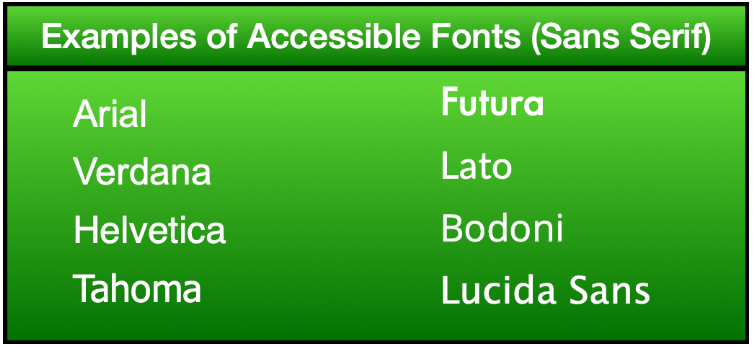
Accessible fonts are fonts that have been specifically designed to be easy to see and read for all learners. Most sans serif fonts are considered accessible.
Sans serif fonts (e.g. Lato, Arial, Verdana, Helvetica) are fonts without serifs, the small articulations sometimes found on the ends of letters. Their block-like and less decorative appearance increases their readability, making them more accessible fonts.

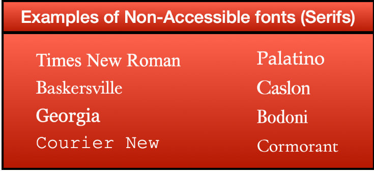
Serif fonts (e.g. Times New Roman, Baskersville, Georgia) have articulations protruding from the edges of the characters, making them difficult for learners with visual impairments to read. Most serif fonts are not considered accessible.

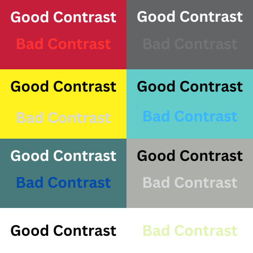
Font contrast refers to the intentional use of varied sizes, weights, and colors within a text to create a visual hierarchy and enhance readability. For example, black text on a white background is an example of high contrast.

Why are accessible fonts and high contrast important to learners?
Accessible fonts and high contrast text are vital for inclusive design, enhancing readability to make reading the text in a course easier for all learners (not just those with visual impairments).
How do I make sure that I am using accessible fonts and contrast?
Default Fonts: It is important to be mindful of default fonts in various applications. For instance, learning management systems like D2L typically use easily readable fonts, like Lato as the default choice.
Font Contrast: To improve the readability of your documents, it is recommended to use black text on a white background. This combination offers optimal contrast and benefits a majority of users.
Accessibility Checkers: To ensure accessibility, use the built-in accessibility checkers available in applications, such as Microsoft Office Suite and Adobe Acrobat. Additionally, WebAIM (Web Accessibility In Mind) provides a color contrast checker (opens new window) designed to verify the best contrast between fonts and backgrounds. Utilize these checkers to identify and address any font-related accessibility issues.
TIP
- Use a minimum of 12-point fonts to body text to maximize readability for all learners.